

Back To Projects
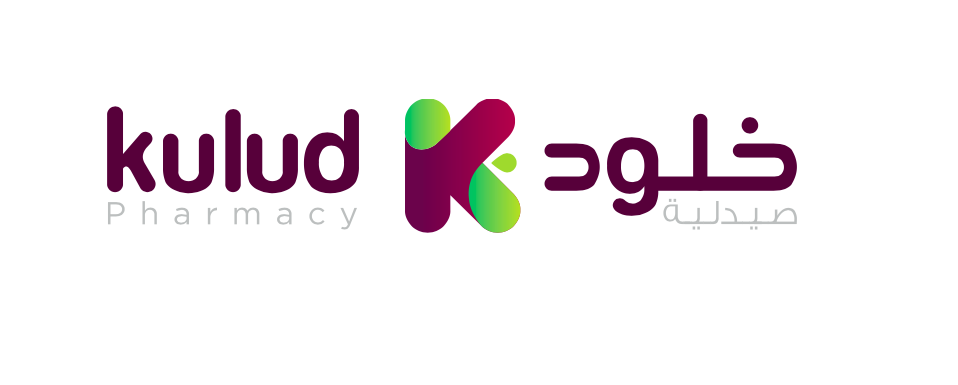
Kulud Pharmacies – Rebranding
As part of a technical branding proposal for Kulud Pharmacies, we developed a warm and human-centered brand identity designed to reflect the company’s core values of care, compassion, and customer well-being. Our goal was to create a visual and verbal identity that resonates with customers while reinforcing Kulud’s position as a trusted healthcare provider in the region.
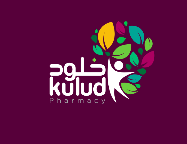
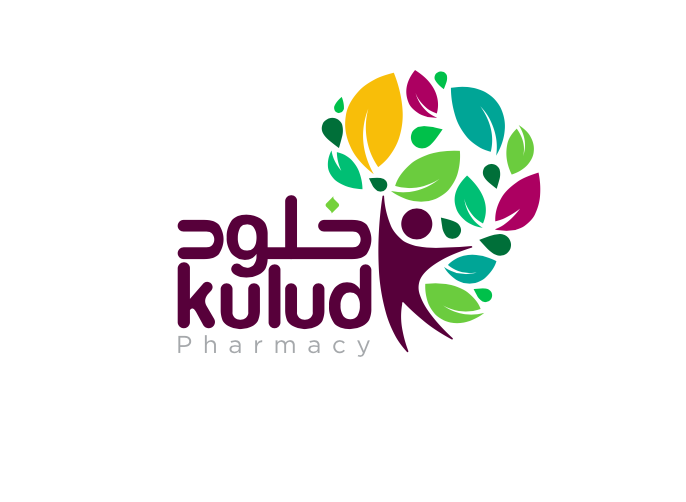
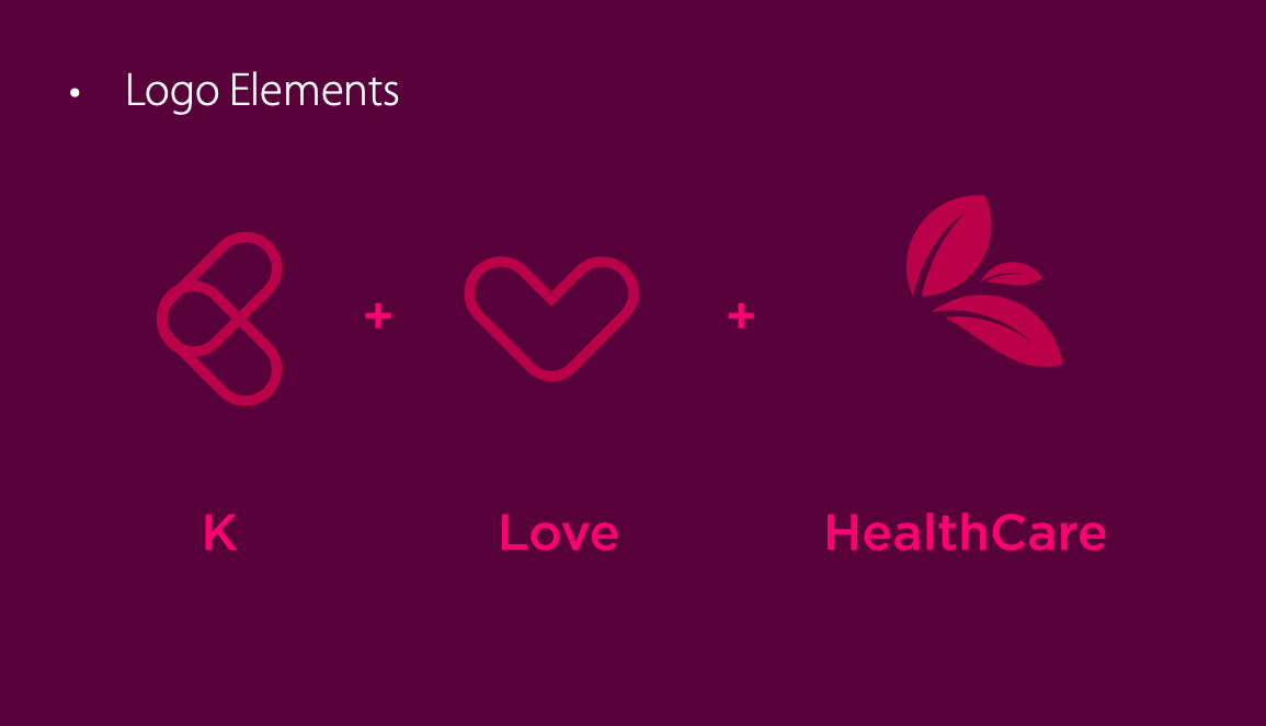
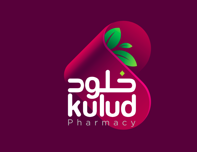
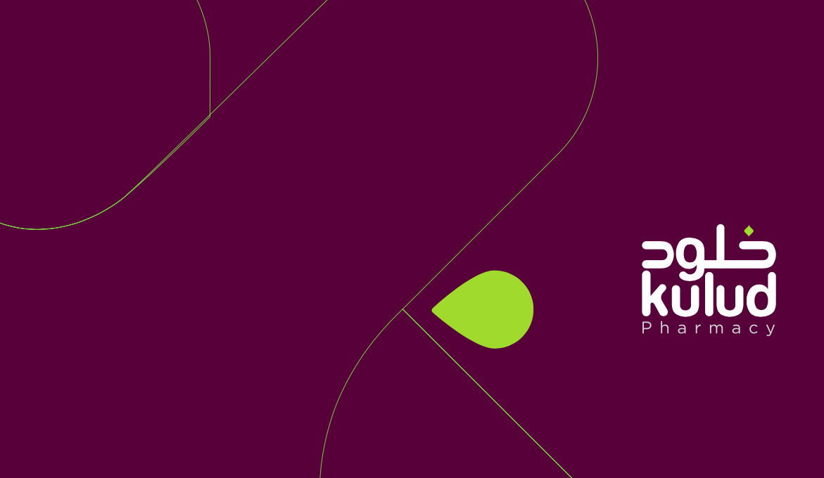
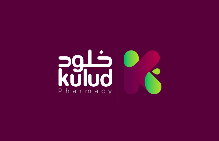
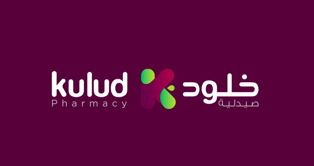
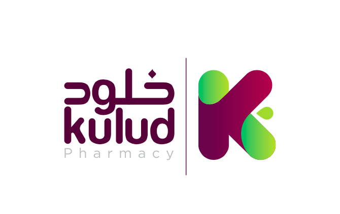
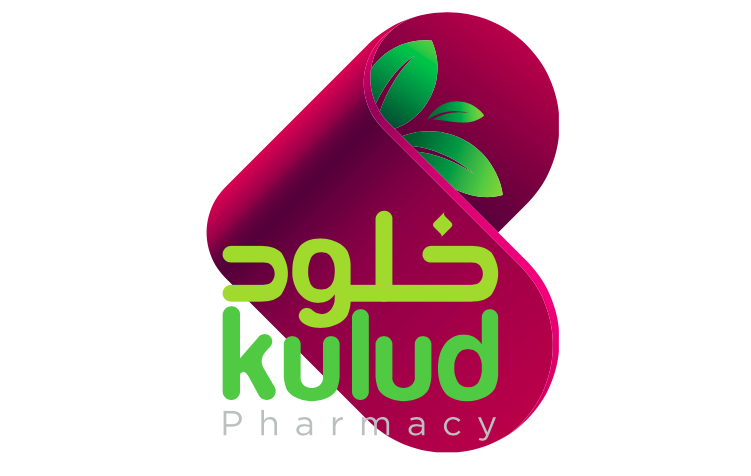
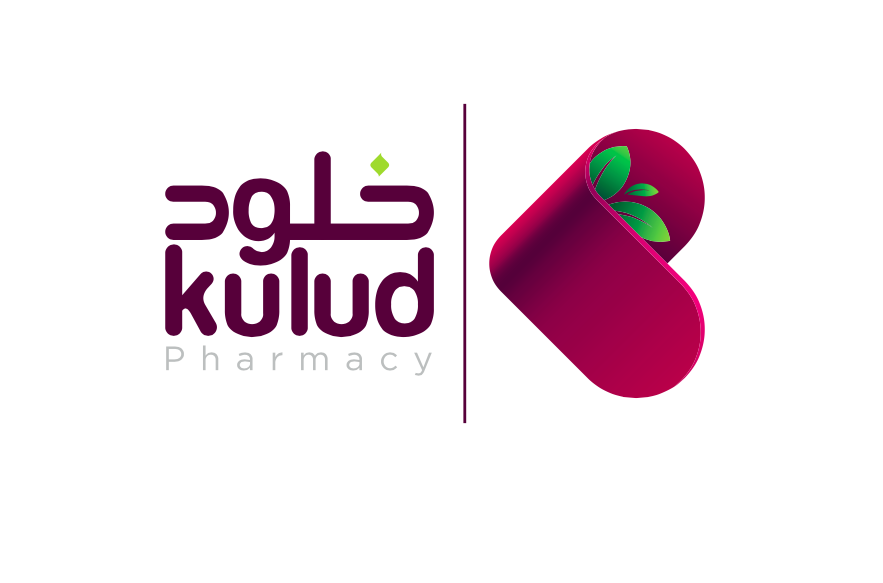
The proposed logo features a stylized figure with outstretched arms, symbolizing support, accessibility, and a holistic approach to health. The design incorporates green, representing wellness and vitality, and blue, evoking trust, reliability, and professional care—two essential pillars of Kulud’s brand.
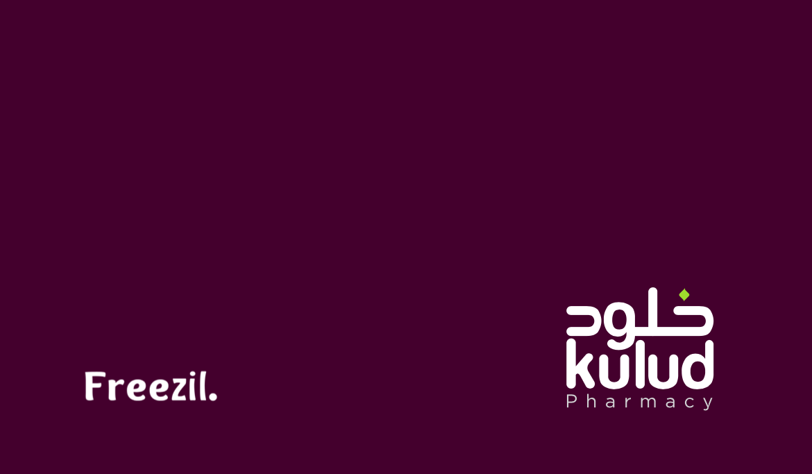
The brand identity is designed to be consistent and instantly recognizable, with strategic use of color, typography, and imagery across all touchpoints—including the website, in-store signage, packaging, and printed materials. This ensures strong brand recall and builds emotional connection with both new and returning customers.
Our recommended brand voice is warm, approachable, and supportive—reflecting a genuine commitment to helping individuals lead healthier lives. This tone is consistently applied across all customer-facing communications, positioning Kulud Pharmacies as a brand that genuinely cares.
This proposal showcases our expertise in healthcare branding, pharmacy brand development, and visual identity systems, offering Kulud a distinctive and trusted presence in a competitive market.
ClientKulud
Year2017
FieldBranding